Accessibility.
If you work with web development you must've heard about this term lately.
It is becoming popular topic on conferences & meetups - whether it's driven by money (an accessible website mean more people can use your product), law, empathy, or simply because of common sense.
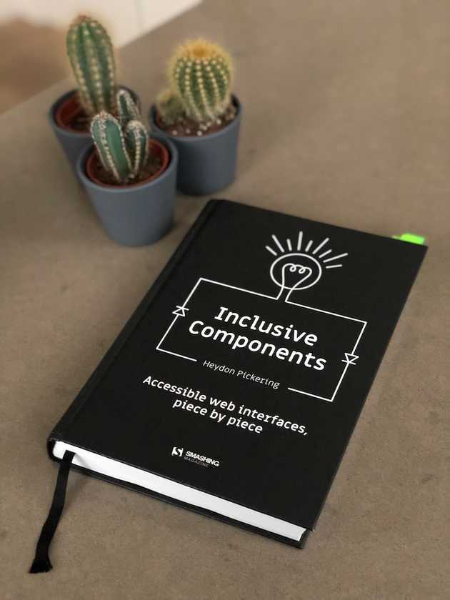
On that wave comes Inclusive Components - Accessible web interfaces, piece by piece, by Heydon Pickering. The book is a comprehensive guide on creating web components with accessibility in mind.
The Book
The first thing you notice about the book is that it has the Smashing Magazine quality standard, both in terms of aesthetics and content.
Throughout 12 chapters, each dedicated to a specific type of component, the author explains in details how to create an accessible user interface from the most basic implementation to the most complete and advanced solution - not forgetting the steps in-between.
It's in the chapter progression that the author excels in creating an engaging and educational writing. As the chapter evolves, so does the component in focus, with new building blocks being added to it. It's an approach that caters for a wide range of readers with different skill sets.
JavaScript wise, it's unbiased towards frameworks (React and Vue are mentioned). In fact, most of the code samples are framework-free. Sometimes no JavaScript solutions are offered, as a display that the web is inclusive by nature.
Visually, the book is simple and beautiful. Perfect binding, high quality paper, and a fabric bound bookmark. I cannot stress enough how much I like this book just for the fact that it has a bound bookmark. Tiny details count, people.
Some Highlights
A theme that is present throughout the book is the fact that you might have to write your code for different audiences. A user accessing your website with a screen reader and one using a mouse and cursor might need different elements to be present on the page.
We can cater the screen readers audience by hiding aesthetic elements with aria-hidden="true" or visually hide verbose elements for the mouse/touch crowd with a custom class like the one below:
.visually-hidden {
    position: absolute !important;
    height: 1px;
    width: 1px;
    overflow: hidden;
    padding: 0;
    border: 0;
    clip: rect(1px, 1px, 1px, 1px);
}
This is a better approach than simply display: none as the latter would remove the element from the visual interface and screen reader output.
Another interesting tip is to not allow non-interactive elements to have focus, which makes sense considering that an element that is focusable means it will also have some sort of feedback when interacted with
Conclusion
As you can see by my bookmarks, this book has tons of useful tips. I've been doing web development for years now and after reading it I felt like I needed to refactor all the things.
I'll end this review with a great quote from the book:
“Inclusive design mantra: If in doubt, spell it out.”
If you don't get it. Go get a copy of the book, you won't regret it.
