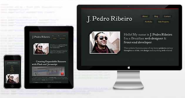
Mobile, tablets, netbooks... today people access websites using a variety of computers and gadgets and that is great, it enable us to reach more people and develop more tools for these new devices. However, due to the wide range of configuration and screen sizes, it can be a bit hard to manage web design and usability.
To help us, CSS3 has a feature called Media Queries which basically enables us to apply different styles to different devices, with just a couple lines of code.
Who's Using It?
My first contact with Media Queries was when reading Andy Clarke's book Hardboiled Web Design (highly recommended!), from there I discovered that this technique is not as new as I thought and a lot of cool and smart people have been using it for a while.
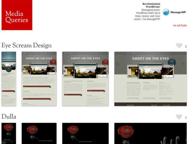
For first timers, I advise having a look at the website gallery mediaqueri.es and just browser around on their selections (you can learn a lot by viewing other people's code).
Basic Functionality
When I was redesigning this site I decided to use Media Queries. This is, of course, my first experiment on the subject so there's always room for improvement. This is how I did it:
So, the code I use is the following:
First line is the basic stylesheet, the one loaded for most screen sizes. On the second line things start to get interesting. On the attribute media I'm specifying a screen size range that fits most mobile, hence the filename "mobile.css". The third line follows the same logic, this time for tablets (or netbooks).
Testing
To test how Media Queries affect this site just resize the browser window. You will be able to see the 3 different stylesheets in action.
Walkthrough
Since the lines are going to be read in order, the browser will the stylesheet widh no conditionals (styles.css), after that it will test the screen size and apply other stylesheets if necessary. Inside mobile.css and tablet.css I rewrote the styling of some layout elements, like the menu, footer, etc. So when the browser picks one of these files it will make the necessary changes in the layout.
On File To Rule Them All
If you prefer to use only one css file to avoid multiple HTTP requests and speed up your site, you can apply the Media Queries rule directly on the stylesheet:
@media (min-width: 320px) and (max-width: 767px) { /* Insert CSS code here */}
Mobile First
Since mobile is growing stronger everyday and mobile users are usually under a download cap, or maybe bad reception, it is wise to apply the mobile CSS first and then the other ones. This idea is shared among several people including the guys at 320 and up. I do believe it is a smart approach but I have not quite found the perfect config for this site, so have a look and see if it fits your project.
Going Further
If you want to go deeper, here is a couple links I recommend on this subject. Also, W3C has a page regarding Media Queries, it's quite complex but worth the look.

